
Shyam Valsan


This is part 2 of the Analyzing Bangalore - Population series. You might find Part 1 and Part 3 interesting as well.
This is a simple smoothed line chart of population growth rate over time, and yet it is very revealing.
library(ggplot2)
blr_growth_rate <- read.csv("BangaloreGrowthRate.csv")

ggplot(blr_growth_rate,aes(x = Time,y = GrowthRate )) +
  geom_point(aes(colour = GrowthRate)) +
  scale_colour_gradient2(low = "blue", mid = "green" , high = "red", midpoint = 3.5) +
  geom_smooth(colour = "blue",size = 0.9) +
  scale_y_continuous(limits = c(1,7), breaks = seq(1,7,1)) +
  scale_x_continuous(limits = c(1955,2030), breaks = seq(1960,2030,10)) +
  ggtitle ("Average Annual Rate of Change of Population in Bangalore") +
  xlab("Year") +  ylab ("Average Growth Rate %")
## `geom_smooth()` using method = 'loess'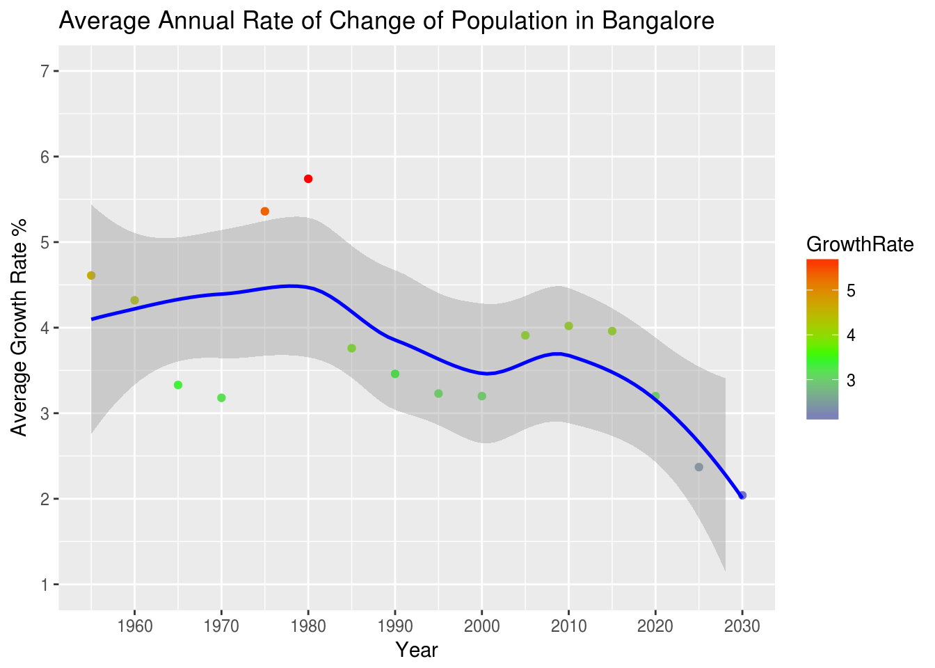
Key takeaways
Let’s examine the two periods of rapid growth in population which Bangalore has experienced in the last 70 years.
Data sources
United Nations Top 30 Urban Agglomerations - Population and Growth Rate
Suggestions and corrections are always welcome, please use the comments section.